B A B ---> <--- select
The Project
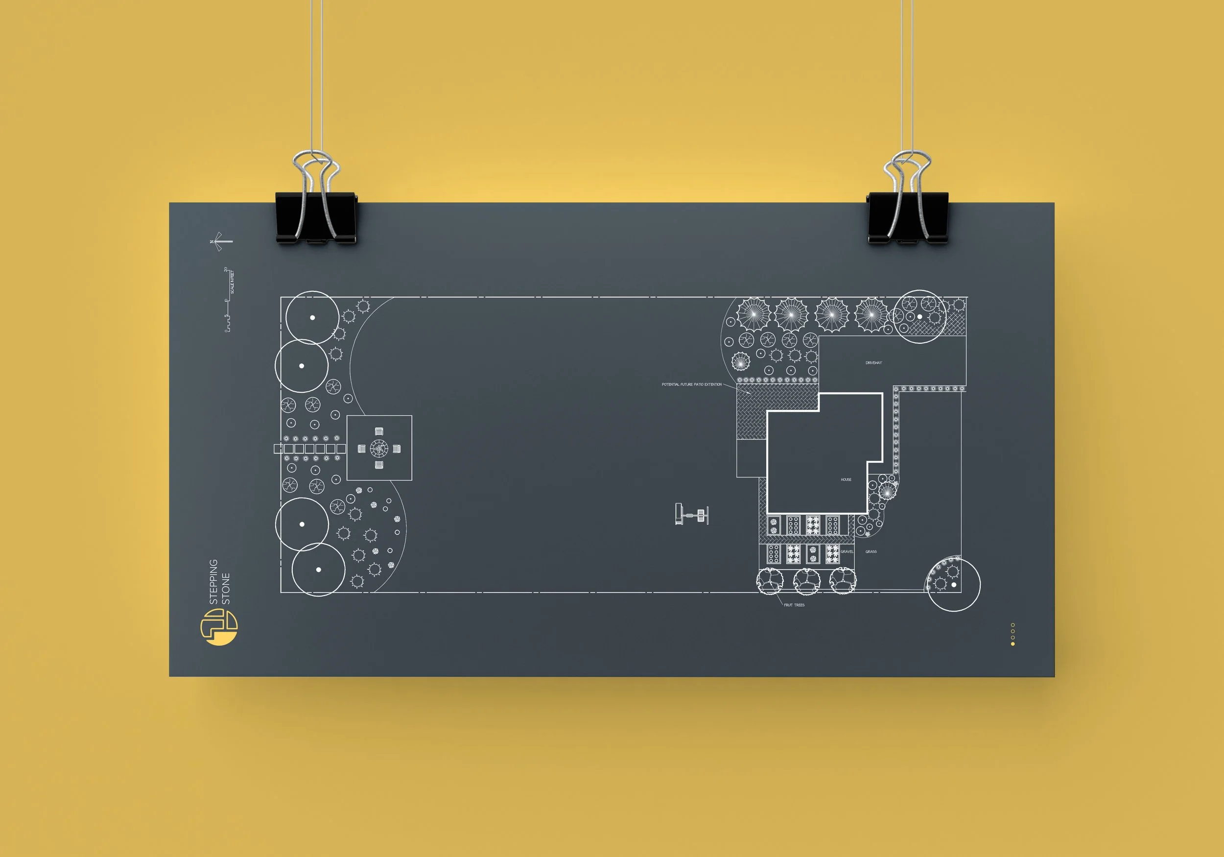
Stepping stone design was a client that wanted to freshen up their brand with a new identity. They specialize in high end landscaping and their work is phenomenal. This was a special project because it was a trade of services. I re-designed their identity, and they drew up an amazing multi phase landscape design for my house:)
The ask
The main ask was to create something that felt high end and stood out amongst the competition. I was given a lot of creative liberty but the requirements gave me enough restraints to get my creative juices flowing. Luckily for me, her local competition did not have strong identities so it was fairly easy to figure out a way to really make them stand out.
With the name stepping stone, It was obvious that the logo mark should represent an actual stepping stone but I wanted more depth than just a stepping stone. As I thought about the process of using a landscape architect, I noticed it’s very common to have multiples phases of planting. Rarely will everything be planted all in one go, so I wanted to the mark to have a dynamic look that represented phases.
Landscaping plans are drawn out on blueprints using line are so I wanted the logo mark to also have an element of a blueprint. I also asked the client what the average amount of phases a client has in their plans and 4 was the most common for them. With all this information, I was able to figure out a fun way to use the logo and have the logo be colored in depending on which phase they client is in when doing their landscaping.
Conclusion
The client was very happy with the results and I really enjoyed helping them revamp their identity.


